Learning programming - easy to start, hard to master
May 17th, 2024
•
8 min read

Flexbox, grid, who's that for? Floats for the win! 🏆
April 1st, 2022
•
4 min read

This blog post was created to celebrate April Fools' Day 2022 🤡
You have probably read the title of this article several times to see if you understand it correctly. Maybe your first reaction was "Wait... what?" and it's totally fine. But, numbers and stats don't lie - almost 92% of senior web developers and HTML programmers use floats as their main component for creating layouts. In this article I'll explain why you should do it, too.
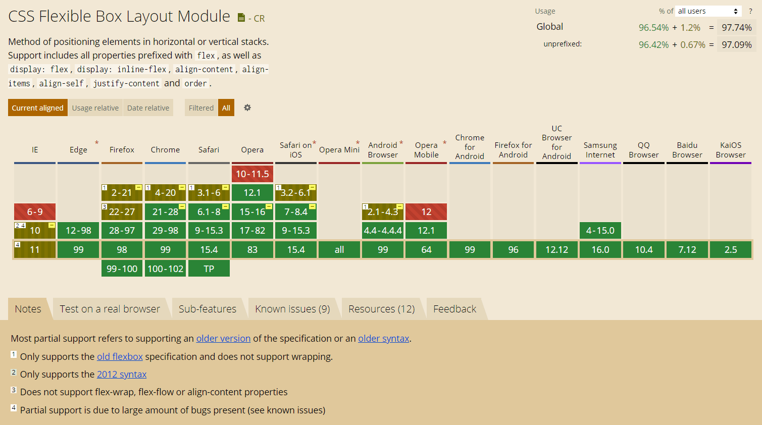
float property is supported by almost all browsers, so you don't have to worry.

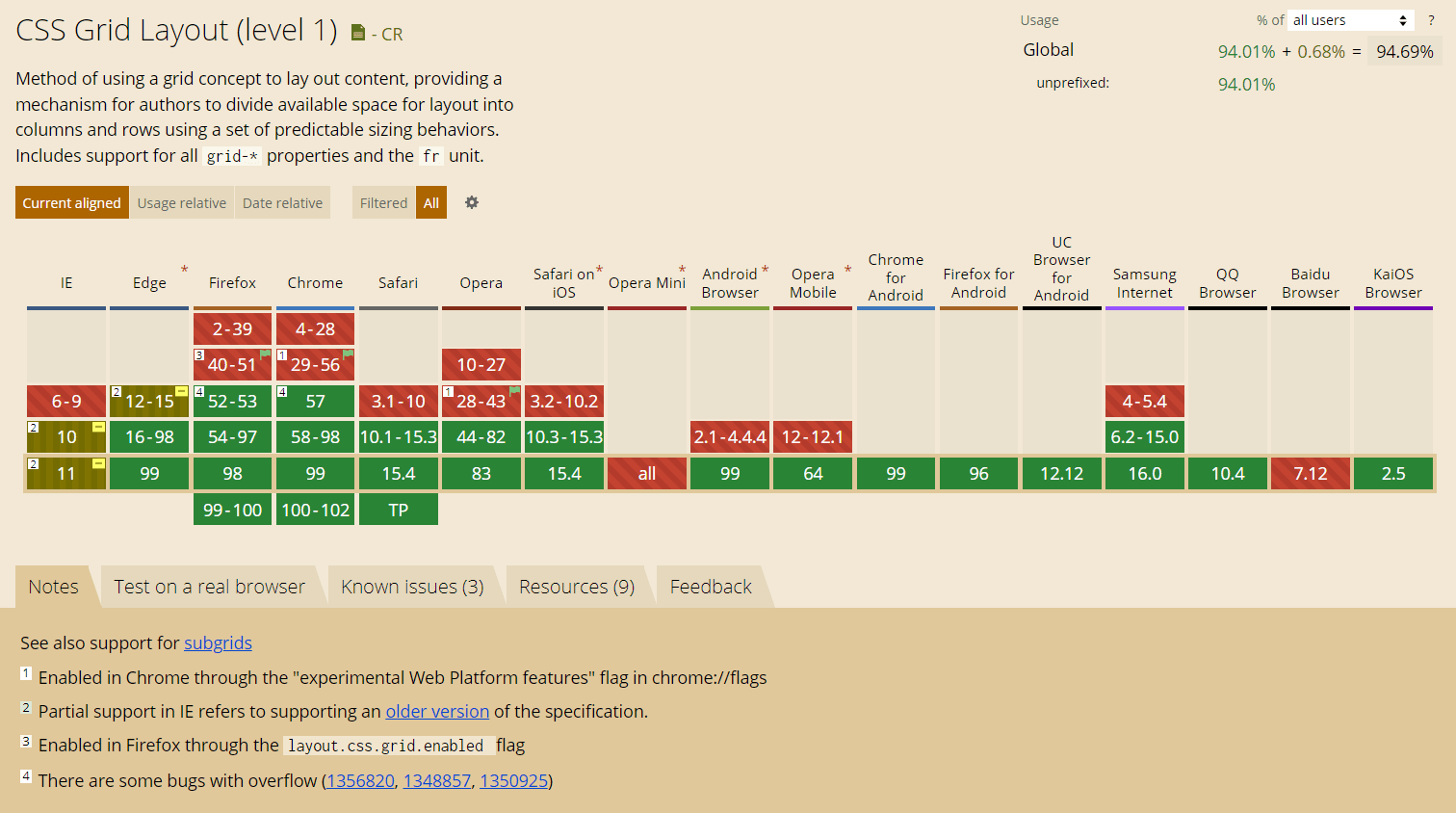
On the other hand, flex and grid also have a pretty good support, but not enough in many ways, right? Every app MUST support IE9 and every developer should know it. Tons of people use Internet Explorer as their main browser,
so I think you don't want to lose your audience by choosing inappropriate technology. "So, what should I do?" you will say
and I will answer: "Use floats!".
Imagine that you get a layout like the one below and you need to code it:
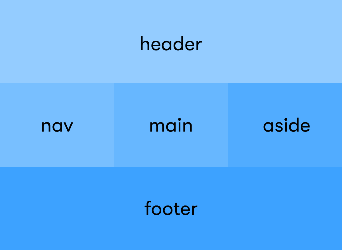
With flex or grid you should consider creating additional containers for each row and column. How to size elements properly? Maybe modify the design a bit? You're wasting time! With float you can do it automatically in "one line" of code:
.nav,
.main,
.aside {
  float: left;
}

.header,
.footer {
  clear: both;
}
Is there a better readable code? Don't answer, that was a rhetorical question.
I think it's the right time to quote my friend's testimony from school while we're preparing for the vocational exam (we had the task of reproducing the given layout of the page):
Not working? Put some float: left in random places and check it again!
Someone smart
And, to my and your surprise, this approach works in most cases! Floats are wonderful!
PS. We passed it! #easy (of course with floats 😁)
If you know that floats were only designed to let text wrap around an image, you should have even more respect for them.
Nowadays, we can build complex layouts using them. Everything thanks to the clear property!
You can clear a footer below two floated columns and float layout came into being. If there had ever been a way to "clear" elements below positioned elements, we'd never have bothered to use floats for layout.
So, to summarize, you can use floats in and for layouts, isn't that nice?
Don't try to convince me that you've never made a typo by using these intricate properties. Or you didn't make the mistake of choosing justify-content, even though you meant justify-items. With floats, all these problems are over!
Using them you have only 25 (5*5) combinations of properties (float/clear) to use. It's so simple to choose appriopriate one.
With flex and grid we are dealing with many more combinations, what I have shown you in the following simple graph:
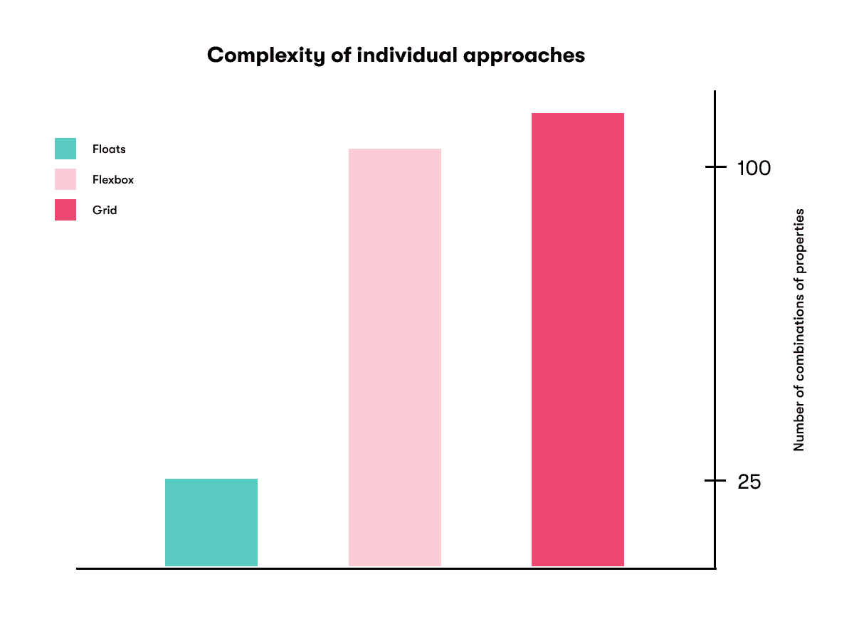
As you can see, the difference is enormous. So why wonder what will be appropriate and how to write it down? Just use floats!
After all these considerations, you might want to consider using tables to create a layout. Don't do this! Tables should be used to create tables and for nothing else!
Using a table layout is really a prehistoric approach that should never take place. Fortunately, our beloved floats have been introduced, with which we can easily create a beautiful layout. 💖
If they weren't, would we still be using tables? Think about it and admit that you have to recognize the superiority of the floats again.
I hope I was able to convince you with this post why you should continue to use floats in 2022. You may accuse me of being biased, but you should ask yourself if you have not experienced the situations described above.
So don't listen to any pseudo-programmer, but think for yourself and use the best tools! 😜
See you next time! 👋 (maybe in more serious post)
PS. To make sure you don't find this article completely pointless, I'm attaching an interesting article about the evolution of layout on the web.

Blogger, software engineer and the main coordinator of this website, he has lots of ideas and won't hesitate to use them! He lives in Poland.
If you find this helpful, you can also check out these posts